
PACKAGE
Retail package design with a focus on stand-out visuals, memorable branding and ease of shoppability. MLD offers logo design, product photography, illustration and variety extensions for new and established products. See some of the work below.
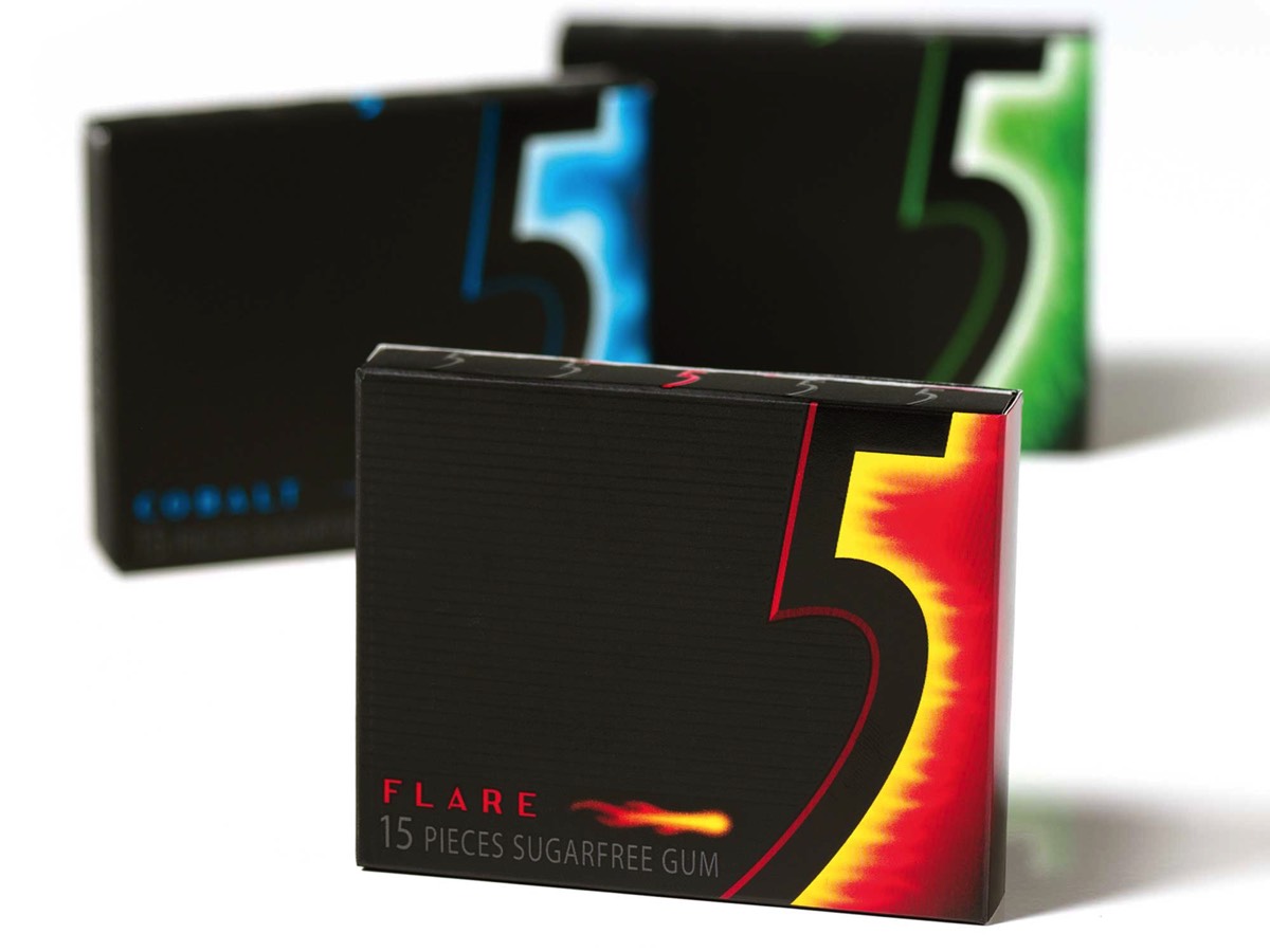
5 GUM
By defining a brand personality of young, cool and mysterious, a huge opportunity surfaced to use a rich black color pallet that would stand apart from the sea of rainbow colors the competition was using. A brand name of ‘5’ was developed that references the 5 senses that the product was designed to awaken. The final package employed embossing, varnishes and foils that all enhanced the visual and tactile nature of the 5 senses concept.
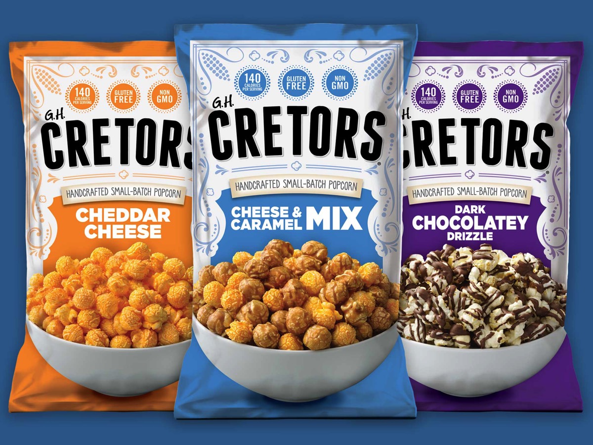
GH CRETORS POPCORN
GH Cretors has a long history, established in 1885 with the invention of the first large-scale commercial popcorn machine. With a refresh of their retail package design to convey a brand voice of Handcrafted Small-Batch Popcorn, sales immediately popped off the charts. Large, bold product photography and color pallets couple with filigree elements for a unique play on modern with a nod to heritage.
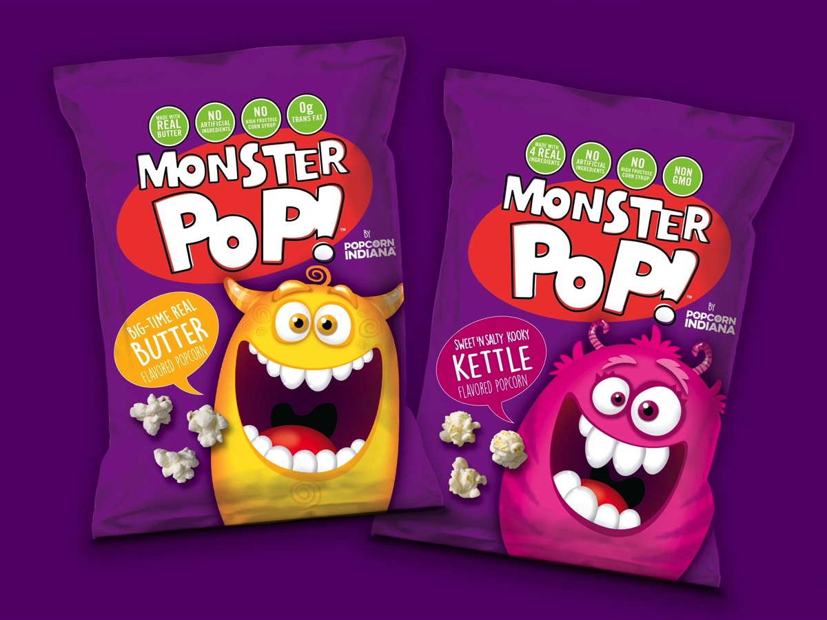
MONSTER POP
Eagle Foods realized there was a big opportunity within the retail popcorn category: a fun kid focused product! Kids love the fun quirky monsters, each with their own personality. Parents love a more wholesome, less-processed snack for their little monsters. A bold, unique look and product created immediate buzz among retail buyers and consumers.
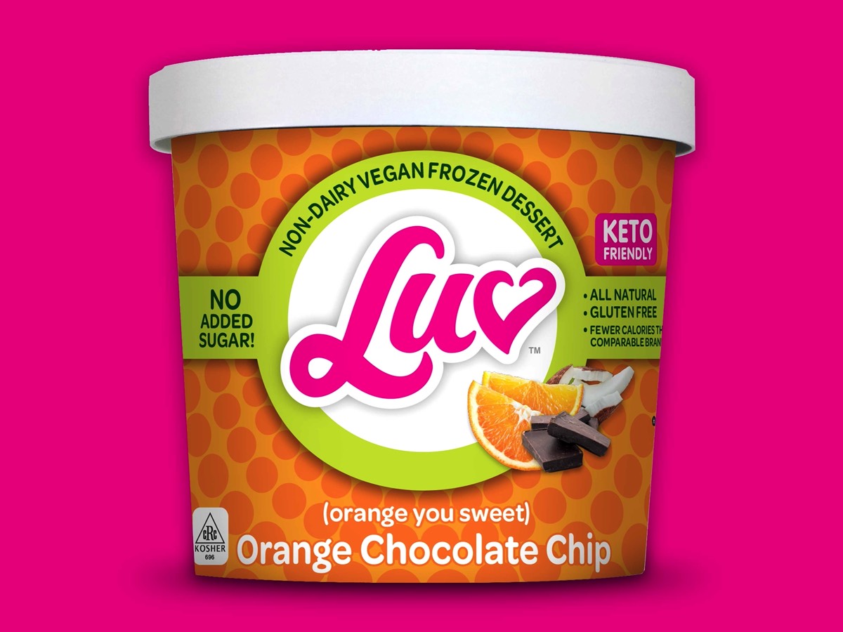
LUV FROZEN DESSERTS
With a name like LUV, the brand conveys an overall bright and happy graphic visual language using jewel-toned packaging, with a flowing logotype for a unique visual that creates lasting consumer recognition. Tonal circle-burst background patterns convey many of LUV’s attributes: expansive, celebratory, uplifting and bursting with flavor. It is a modern version of 60’s op-art and groovy-fun!
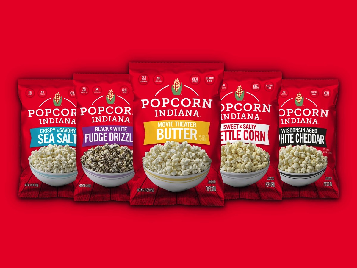
POPCORN INDIANA
Popcorn Indiana embodies the small midwestern spirit of its namesake, with a focus on wholesome ingredients, and a tagline of "Fresh from the Heartland". Consistently branded red color pallet and bold flavor variety ribbons create a look that is easy to shop. Custom popped-ear-of-corn icon in the logo is memorable and speaks to fluffy, fresh kernels that are delicious!